Looking back from 2026, Rolex’s 2025 releases are more interesting for their details than for the colours that originally made the headlines. Lavender, sandy beige, pistachio green, turquoise blue and deeper green tones attracted plenty of attention at launch, but a year later the more useful question is how Rolex used those colours without changing the identity of its best known watches.
That matters on TopReplica.us because our focus is Rolex replica watches. Rather than treating every new dial as a short lived trend, it makes more sense to look at what actually changed, how those changes affected the character of each model and which details became difficult to reproduce convincingly once replica versions began appearing.
The Oyster Perpetual was probably the clearest example. Its lavender, sandy beige and pistachio green dials looked fresh, but the colours themselves were only part of the appeal. The softer matt finish gave them a quieter appearance than a highly polished or sunburst dial would have done. That distinction is easy to miss in photographs and even easier to lose on a replica.
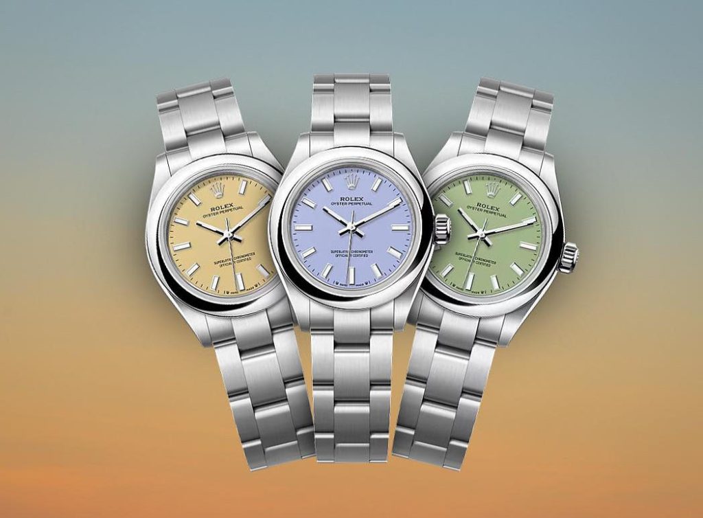
Two watches can both be described as pistachio green and still look completely different in person. One may be too yellow, another too bright, while a third may have the right general shade but a surface that reflects far more light than the genuine design. For anyone comparing an Oyster Perpetual replica with a pistachio or lavender dial, the finish is often more revealing than the colour name used in the listing.
The simplicity of the Oyster Perpetual makes those differences even easier to see. There are fewer decorative elements to distract the eye, so an oversized bezel, heavy lugs or a bracelet that does not meet the case cleanly can quickly disturb the balance of the watch. Readers who want to compare more versions can browse our Rolex Oyster Perpetual articles.
The Daytona went in the opposite direction. One of the most noticeable 2025 combinations paired yellow gold with a turquoise blue lacquer dial, black chronograph counters, a black bezel and an Oysterflex bracelet. It was a much stronger use of colour, but the darker counters and bezel kept the familiar Daytona structure intact.
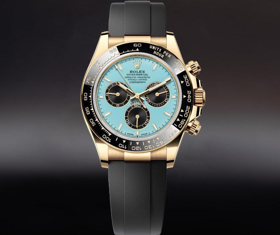
That balance is important because the Daytona already has a busy dial. Three subdials, applied markers, text, hands and the tachymeter all compete for space. Once the background becomes brighter, the proportions of those elements become even more noticeable.
A Rolex Daytona replica with a turquoise blue dial therefore needs more than a convincing shade of blue. The size and position of the counters, the thickness of the bezel, the shape of the pushers and the overall case profile all affect how close the watch feels to the reference. Strong colour can make those differences easier to notice rather than hiding them.
The GMT Master II showed another side of Rolex’s 2025 design direction. Ceramic and natural stone brought very different surfaces into a familiar sports watch. A ceramic dial depends on gloss, colour depth and the way it reflects light. A stone dial works almost in the opposite way, because irregularity and natural variation are part of what makes it convincing.
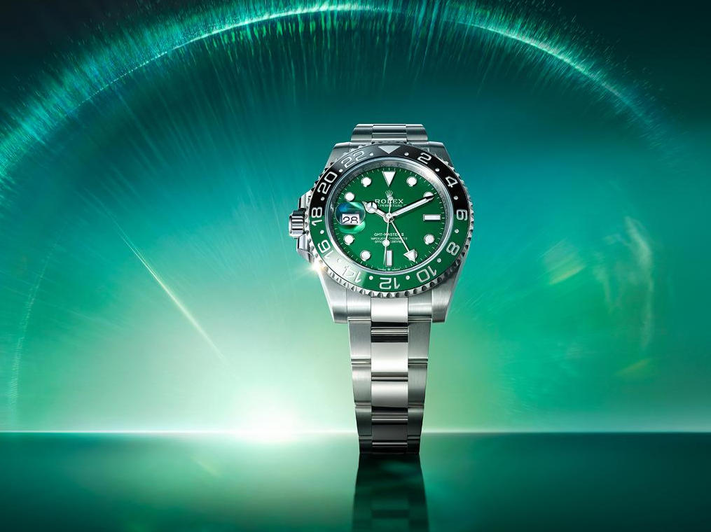
This is where Rolex GMT Master II replica dial and bezel details become more important than the basic colour description. A replica may get the green reasonably close but still fall short because the bezel numerals are too heavy, the ceramic surface lacks depth or the dial looks too flat. On stone inspired versions, an obviously repeated pattern can make the material look printed rather than natural.
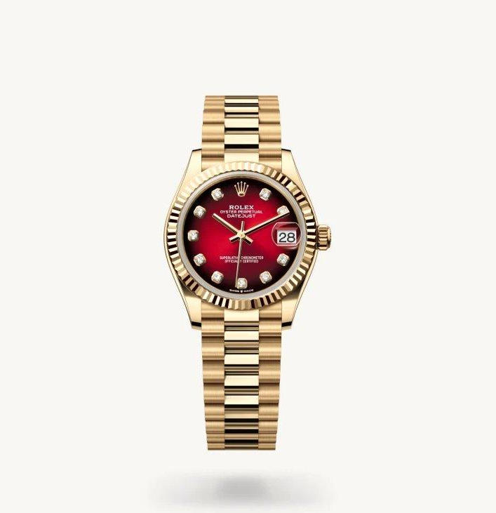
The Sky Dweller and Datejust reinforced the same idea. Rolex used stronger colours while keeping the familiar architecture of each collection intact. The Sky Dweller still relied on its fluted bezel and complex dial layout, while the Datejust used the ombré effect to create depth rather than simply applying a flat red finish.
Gradient dials are especially revealing on replica watches. A good transition should feel gradual, with the colour becoming darker toward the edge without creating an obvious border. If the centre is too bright or the outer section turns black too suddenly, the effect immediately looks less natural.
Why These Details Matter More in 2026
By 2026, the first wave of excitement around these watches has passed. That makes it easier to separate the details that genuinely changed the character of a model from the features that were simply useful for launch photography.
Colour was important, but case proportions, bezel width, bracelet fit and finishing still do most of the quiet work. These are the areas that determine whether a Rolex feels balanced when it is actually on the wrist.
The Oyster Perpetual shows this through simplicity. The Daytona shows it through complexity. On the first, one wrong proportion stands out because there is nowhere for it to hide. On the second, several small inaccuracies can accumulate until the watch starts to look heavier and less refined than the original.
That is why case proportions and bracelet fit on replica Rolex watches are often more useful to examine than seller labels. Terms such as Swiss movement, Japanese movement or clone movement may describe part of the specification, but they say very little about whether the watch actually looks right.
Diameter alone is not enough either. A Datejust 36, Oyster Perpetual 36, Daytona and GMT Master II can all feel very different on the wrist because lug length, thickness, bezel width and bracelet taper affect how large a watch appears. A replica can quote the correct case size and still look noticeably too bulky.
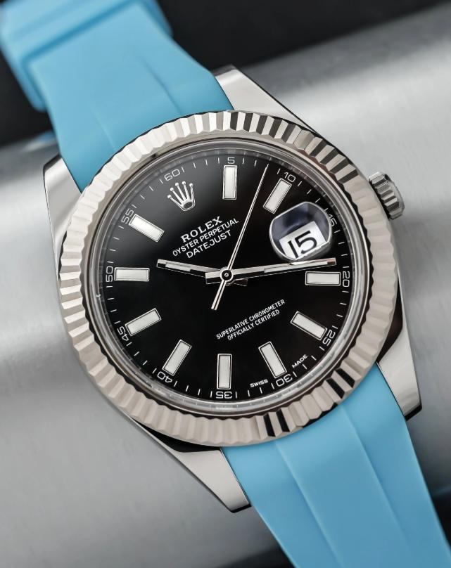
The same practical approach should be taken with straps. The earlier version of this article placed too much emphasis on aftermarket rubber straps as though they represented a major Rolex trend. In reality, a third party strap is simply a personal modification unless Rolex itself uses a comparable configuration.
A rubber strap can still make sense for someone who prefers a lighter or more casual feel, especially in warm weather, but the brand name matters less than the fit. The attachment to the case, the shape of the end pieces and the overall proportion of the strap determine whether it looks intentional or added as an afterthought.
Seen from 2026, the real value of the 2025 releases is that they made familiar Rolex details easier to study. The softer Oyster Perpetual colours exposed differences in dial finish. The turquoise Daytona made subdial proportions and bezel contrast more obvious. The GMT Master II highlighted the difference between ceramic, natural stone and conventional lacquer, while the Datejust showed how difficult a smooth gradient can be to reproduce properly.
For readers following Rolex replica watches based on 2025 dial designs, those observations remain useful long after the original launch period has passed. Colours may move in and out of fashion, but the relationship between the dial, bezel, case and bracelet continues to decide whether a watch looks convincing.
That is also the better way to approach Rolex replica watches in general. Instead of asking whether a particular colour is still fashionable, look at whether the dial finish feels believable, whether the bezel has the right proportions, whether the case sits naturally and whether the bracelet belongs visually to the rest of the watch.
Rolex did not reinvent its core collections in 2025. It changed enough around the edges to make familiar watches feel different without losing their identity. A year later, that restraint is what makes the releases worth revisiting. The strongest designs were not defined by one headline feature, but by several small decisions working together.


